On this page
How to: build a form
- 1Open the task in the template. The Form tab shows the field list on the left.
- 2Click Add field at the foot of the list and pick a type.
- 3Give the field a Label in the settings panel on the right, plus a Help text if needed.
- 4Under Rules, decide whether the field is required and when it appears.
- 5Switch to Preview at the top and fill in the form as a test.
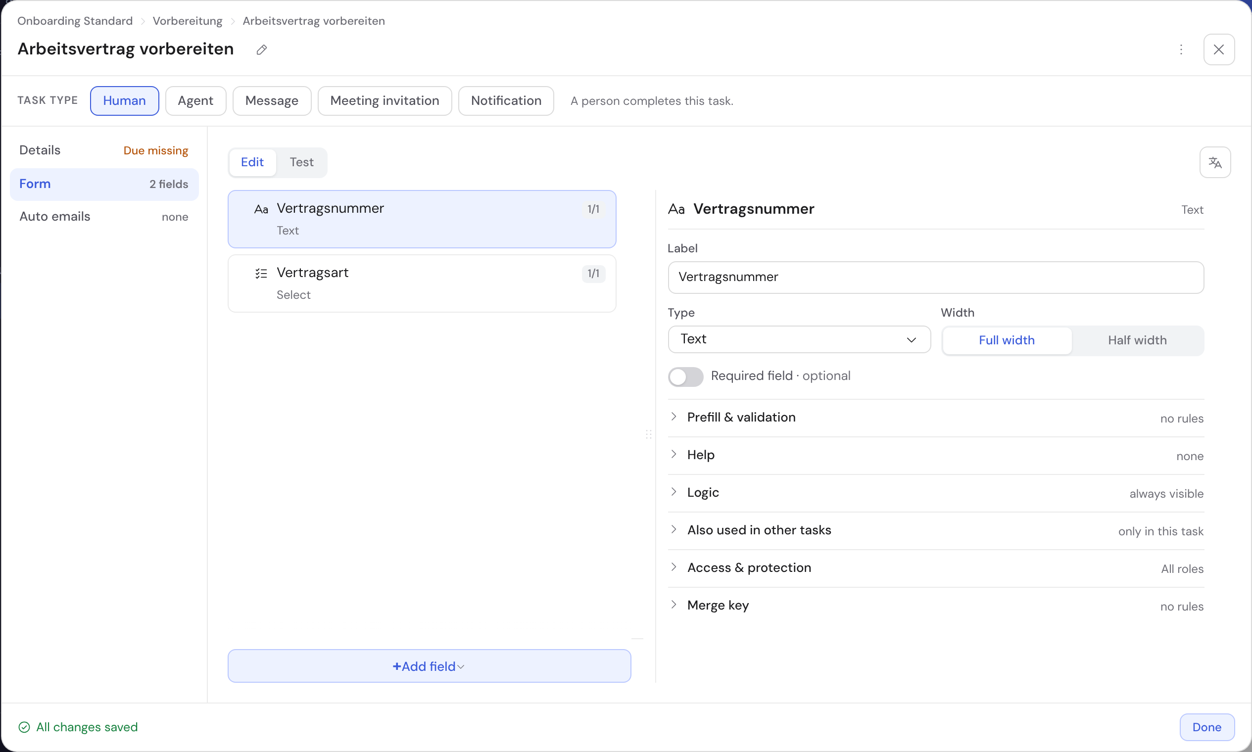
- 1Field list: a click selects a field
- 2Add field: opens the type menu
- 3Settings panel of the selected field
- 4Edit · Preview switch
Add and arrange fields
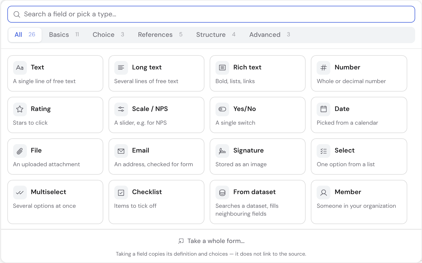
Add field opens a searchable menu with every type as a tile. The tabs above filter by category: Basics, Choice, References, Structure and Advanced. The search covers the descriptions too: “stars” finds Rating.
From the second character on, the search also finds fields from other tasks. Carry here turns it into one field with one value for the whole case. Copy here creates an independent field with the same settings.
For another task's whole form, choose Take a whole form… at the foot of the menu. Reorder fields by dragging. You can change the type later, except for calculated fields and a few special types.
Which field type do you need?
| Type | What for | Special feature |
|---|---|---|
| Text | Short entries such as a name or reference | Maximum length and format: free text, email, phone, IBAN or a custom pattern |
| Long text | Descriptions, notes, justifications | Like Text, but multi-line and without IBAN |
| Rich text | Reports and minutes | Bold, italic and lists via a toolbar |
| Email addresses | The format is checked; the address is clickable later | |
| Number | Quantities, amounts, percentages | Min/max, one unit (€, %, kg …), input field or slider |
| Rating | One to five stars | As stars or as a slider with labelled ends |
| Scale / NPS | Satisfaction, recommendation | 0–10 by default, range and endpoints adjustable |
| Date | Dates and deadlines | Allowed dates: all, future only, past only or a range |
| Yes/No | Confirmations and approvals | Optional Must be confirmed with Yes: otherwise the task cannot be completed |
| Choice | One option from a list | Colour, icon and free text per option; can depend on another choice |
| Multi-select | Several options at once | Like Choice |
| Checklist | Items to tick off | Shows progress |
| Member | An internal person, e.g. a reviewer | Only assignable members; with Allow multiple a whole team |
| Contact | External contact person | Search or create inline; added to the organisation's contact list |
| Company | External customer | Like Contact; the list prevents duplicates |
| File | Evidence and attachments | Number, allowed file types and size per file |
| Signature | Approvals with visible evidence | With mouse or finger, stored as an image |
| Section | Sub-heading in the form | Groups the following fields, captures no value |
| Note text | Explanation in the middle of the form | No input; bold and field values are possible |
| From dataset, group, rollup, reference, formula | Look up values, repeat rows, calculate | See Calculations in templates |
Options in choice fields
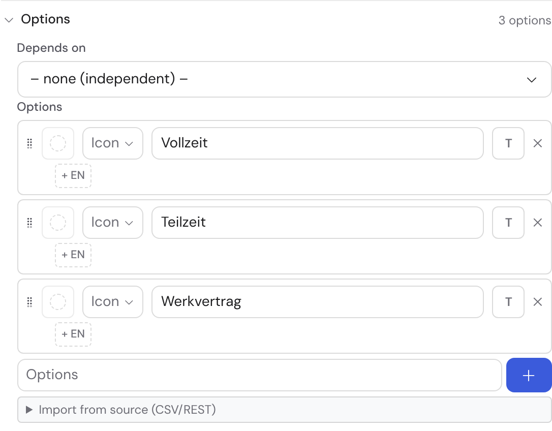
- Choice, multi-select and checklist have an option list. Reorder it by dragging and add options one by one.
- Pick a colour and an icon per option. An option such as “Other” can also allow free text.
- Under Depends on you subordinate a choice field to another. Only the options matching the chosen parent option then appear.
- Import from source (CSV/REST) pulls options from a list.
File fields
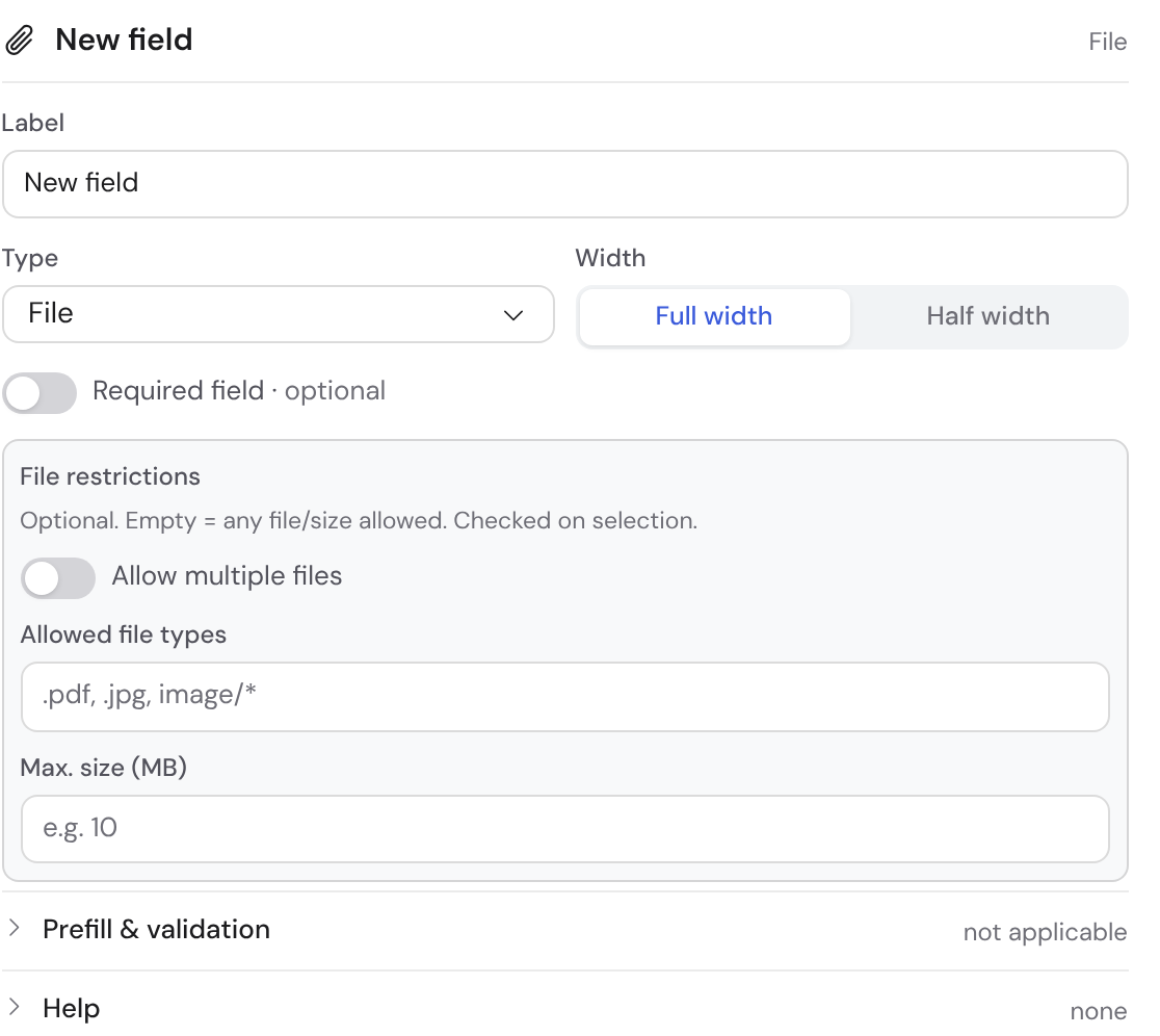
Under Number you choose One file or Several. You also set the allowed file types and the size per file. Empty means: any file is allowed.
Show a file or date from the parent case
- If orders are created from a quote, a file field can be the same field as in the quote. Choose Shows field from parent case for this. The signed contract then exists only once.
- This only works for single-file fields. Required is turned off.
- A date field works the same way: if the date is already set above, it is read-only here.
Configure a field
The settings panel is split into sections: Label, Input, Rules, Reuse and Access & privacy. Most fields share the same base settings.
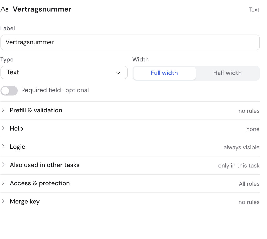
| Setting | Section | What it does |
|---|---|---|
| Label | Label | The name above the field. If you rename it, conditions and formulas keep working. |
| Help text | Label | A short hint directly below the field. |
| Detailed explanation | Label | Longer text as a ?-tooltip next to the name. |
| Placeholder | Label | Grey text in the empty field, not a stored value. |
| Prefill (default) | Input | A value already in the field. |
| Width in the form | Input | Full width or Half width: two half-width fields sit side by side. |
| Required | Rules | Always, Never or Only if … with a condition. |
| Show | Rules | Always or Only if …. A hidden field is not required. |
| Ask when creating | Rules | The field already appears in the New case window, see Template settings. |
| Token | Reuse | A fixed name for messages, documents and agents. Derived from the label and unchanged when you rename. |
| In other tasks | Reuse | Carries the field into further tasks, see below. |
| Who sees / who fills it in | Access & privacy | Restricts the field to roles. Empty means: everyone. |
| PII (sensitive) | Access & privacy | Marks personal data. |
| Field retention | Access & privacy | Clears only this value after a period of its own. |
| Exclude from AI steps | Access & privacy | AI steps don't see the value. Emails are not affected. |
Settings for sub-fields of a card group
- Don't ask when creating: the card appears in the New case window without this field. It is filled in later in the task.
- Always show directly: an optional field stays open instead of sitting under More details.
- Show in the card header: the collapsed header shows exactly these fields, e.g. “Exhibition stand · €31,500”.
- How to set up card groups is described in Calculations in templates.
Translate fields
If a translation is missing, the field shows a yellow badge such as DE missing ›. Clicking it switches on translation mode. The original then sits greyed out above each text, with the target language or + DE below.
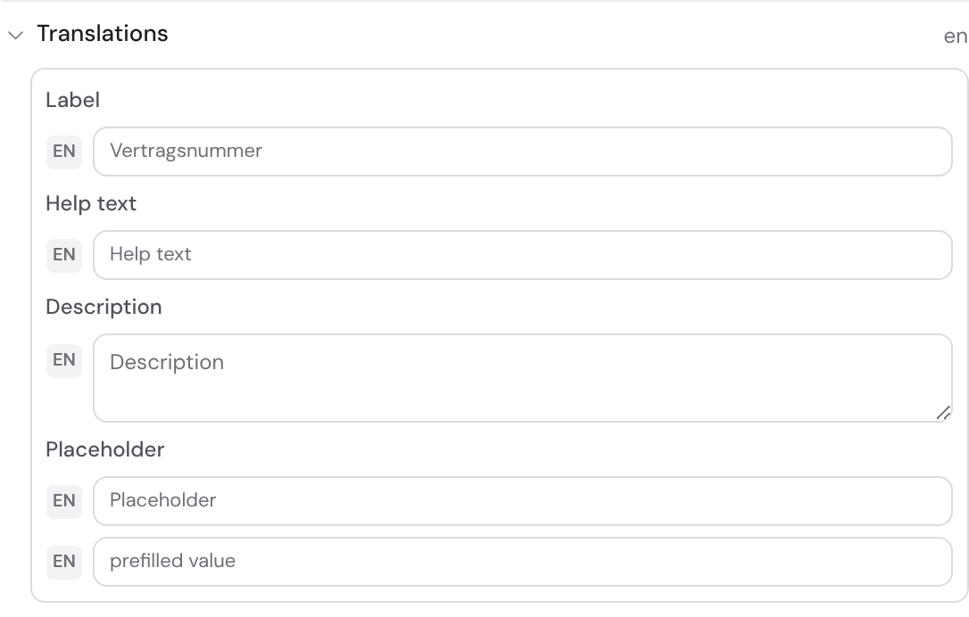
Label, help text, explanation, placeholder, default value, options and units are translated. Type, rules and access apply to all languages. The base segment of the language switcher takes you back to building.
Have entries checked
| Rule | Field type | Effect |
|---|---|---|
| Min/max | Number, Scale | Values outside are rejected |
| Unit | Number | Shows kg, € or % after the number; the number is stored |
| Slider with step | Number, Rating | Input by slider instead of keyboard |
| Allowed dates | Date | A fixed range or future only / past only |
| At most … characters | Text, Long text | Limits the length |
| Format or pattern | Text, Long text | Email, phone, IBAN or a custom regular expression |
| File restrictions | File | Allowed types, size per file, one or several files |
The same rules apply inside the cards of a group. If an entry doesn't fit, the hint shows in red at the field. An empty field is always valid; whether it must be filled is checked on completion.
Show fields only when needed
Under Rules, two conditions steer a field. Show: Only if … displays it only when another field matches. Required: Only if … makes it mandatory only then, for example when “Reason is Other”.

Ask only for what the next step needs. Surface special cases only on demand. The available comparisons are listed in Order, branches and conditions.
Check the form in the preview
- On the right of the tab row you switch between Edit and Preview. You can fill in the form there; nothing is saved.
- With View as you pick a role. Restricted fields are then missing or carry a lock, just as in a case.
- Try completing marks missing required fields. Conditional requirements apply immediately.
- Reset clears everything again. Fields from the case show a labelled sample value.
Carry a field across several tasks
Some entries accompany the whole case, such as a customer number. Pick the further tasks in the Also used in other tasks section. It stays one field with one value: whoever changes it changes it everywhere.
| Level | What the task may do with it |
|---|---|
| Can edit | Set and change the value |
| Read only | See the value but not change it |
| Do not show | See nothing; conditions and deadlines still use it |
Do not show only tidies up the form. Who may really see a value is set under Access & privacy.
In the target task, a carried field has a dashed frame and the note “one value”. There you change the level, end the carry or drag the field to another position. You can only delete it in its home task.
Fields in externally completed tasks
- Each external task has three checkboxes: Visible externally, Editable externally and Visible in the approval. All three start off.
- Editable externally requires Visible externally and switches it on too.
- The checkboxes apply per task. So check every external task individually before carrying a confidential field.
Carry cards into a later task
- A card group, such as quote positions, stays in its task. The later task sees the same cards.
- With Can edit you tick Editable in this task per column, say “Committed”. Everything else is shown there with a lock.
- A second checkbox Required demands the column on every card in this task. Cards can only be added or deleted in their own task.
What cannot be carried
- Sub-fields of groups, fields created in a single case and fields of externally completed tasks as a source.
- Types without a value at case level. Carrying works for text, long text, number, date, yes/no, choice, member and file.
- File fields that accept several files. Here only Copy here remains.
The assignment takes effect from the next case. Running cases stay as they started.