On this page
My Work — your starting point
My Work gathers all the open tasks assigned to you — across all cases. Instead of looking into each case separately, you have your personal work list in one place. By default the tasks are sorted by due date: overdue and soon-due first. Above the list you also find the entry point for a new case and quick access to the cases you starred — which is why the page is called My Work and not just My Tasks.
The list shows the tasks of the active organization. If you open a link to a task in another of your organizations, a notice appears first, naming both organizations and offering a switch — the task is still yours, just in a different tenant; see Settings and account, section Active organization.
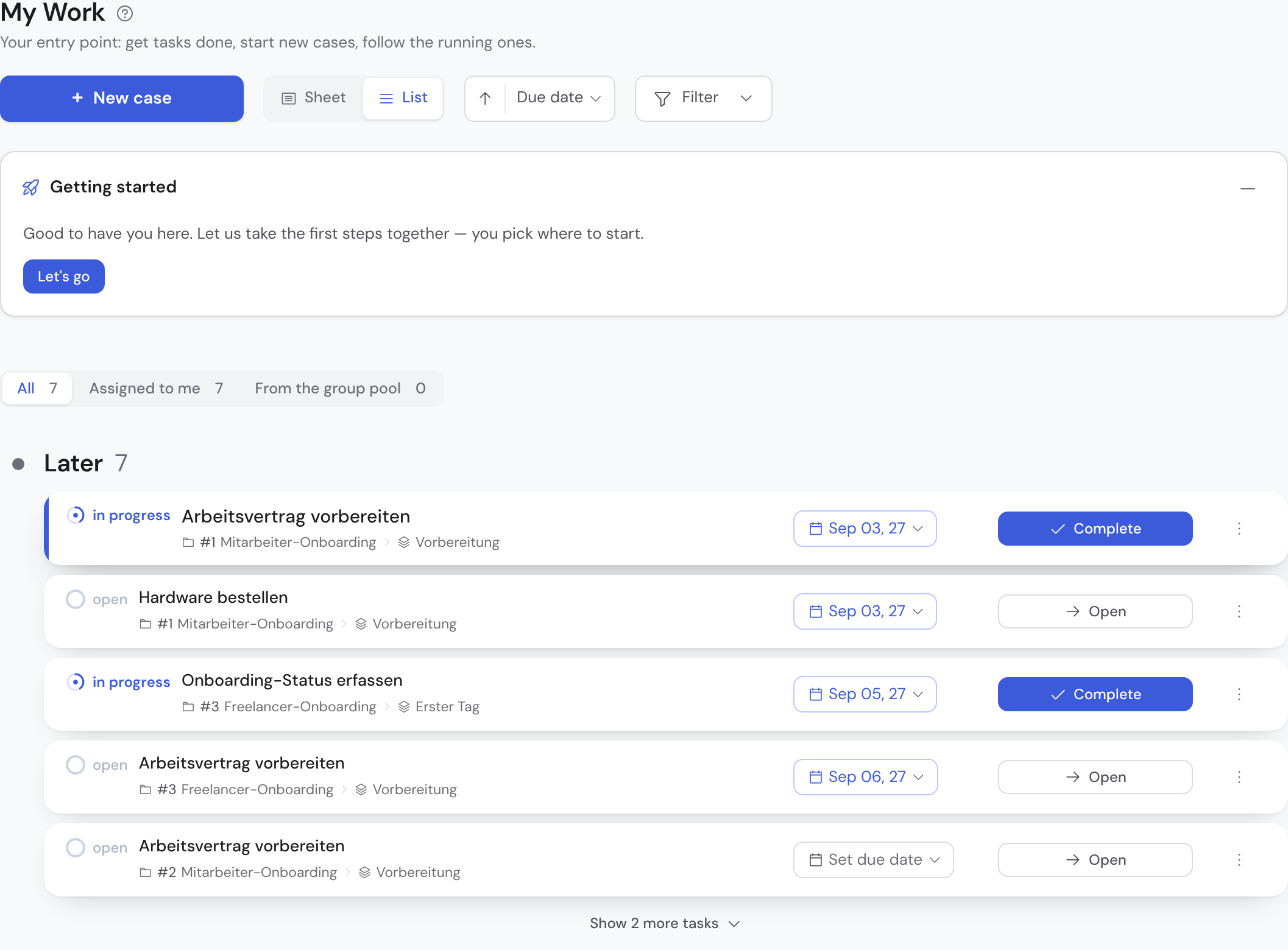
- At the very top you pick the view: All, Assigned to me or From the group pool. Each setting carries its count.
- Below that the tasks sit in sections — Overdue, Due today, Later and From the group pool. Each section carries a coloured dot, its name, the count and, on the right, a hint about where it stands: “for up to 3 days”, today's date, “nobody assigned yet”. A vertical rail connects the dots.
- At the top right, level with the page title, sit all the tools of the page: My favourites, Create case, the Sheet/List switch, the sort control and the “Filter” button. Filter bundles assignee, case, priority and status into one dialog; the number on it says how many are currently active. On the phone the header is too narrow for that — there, Create and Filter stay below the title as before.
- Each card shows where it lives — “Case › Phase” — below the task name.
- On the phone the structure stays the same, only narrower — status, due date and the most important action stay within reach.
The view: who the task is for
Above the list sits a switch labelled Responsibility, with three settings: All, Assigned to me and From the group pool. That is the first question of the morning — what is on my plate, and what is up for grabs. “Assigned to me” shows what is yours by name, including what you submitted for approval; “From the group pool” shows the tasks nobody has claimed yet and that you can take. Each setting carries its count, and the three numbers add up: All is the sum of the other two. Your choice is remembered on this device.
If a view is empty, Bricksta says so explicitly — “Nothing in this view”, with a note that your other views may still hold work. An empty area without an explanation would be ambiguous here: it could mean you are done for the day, or a filter you forgot about.
Sections by due date — and the cap at five
Within the view, tasks sit in three sections: Overdue, Due today and Later. A task with a plain due day becomes overdue on the day after — counted by the calendar day in Berlin, whatever time zone your computer runs in. Each section header names its count. So that one full section does not eat the whole page, each shows at most five tasks at first; below them a button reads “Show n more tasks”. One click expands the section, a second one collapses it again via “Show less” — expanding works per section, the others stay as they are. After a holiday two dozen overdue tasks are easily reached; without the cap everything else would sit below the fold. There is one exception: if you claim a task from the pool and its section is already full, it stays visible anyway — otherwise it would disappear at the very moment you took it.
One card is highlighted: the most urgent task you can actually work on. Blocked tasks and ones already submitted are skipped — they stay visible, but they do not carry the “this is next” mark. That way the loudest card on the page is never one where nothing can happen.
Creating a case from here
On the desktop, New case and My favorites sit up in the page header, to the right of the title; on narrow screens they sit below it. Either one expands its panel underneath the header, and at most one is ever open — opening the second closes the first. While both are closed the entry point costs no space of its own, so your task list stays the centre of the page.
New case shows the templates grouped by category, with a search field above them. Recently used comes first, holding the three templates you started yourself most recently. Each card states the number of steps created on start; where a template has a description, the question mark on the card reveals it. Clicking a card creates nothing yet — it replaces the list with the start form.
In the start form only the name is visible — it may stay empty, in which case the template name and number carry the case — along with whatever details your template asks for. Everything else sits collapsed under More settings: owner, priority, category, due date and the start choice. The current values are spelled out next to it, so you can read them without expanding. The case is only created when you submit, and you land straight in it.
The start choice under More settings decides what happens right after creation. Start right away — the default — lets the template's default workflows run immediately. Choose workflows first creates the case as a draft instead; you then decide inside the case which workflows should run before the first task exists.
Only templates you are actually allowed to start are offered. If a template is restricted to certain people or groups and you are not among them, it does not appear here — not even when you hold a task in a case created from it. If your organization has no startable template at all, the button is greyed out and states why. If you lack the permission to create cases, it is not shown at all.
- My favorites: the second button carries the number of your favorites and expands them as cards — each with its current state, such as “running · step 2 of 5”, “awaiting approval” or “blocked”. Clicking a card opens the case. The button only appears when you have favorites at all; unstar the last one and it disappears.
- Unlike before, the panel shows all favorites at once — there is no “Show N more” any longer. From about ten onwards it gets its own scroll area so it does not push your task list away.
- When you have no task at all, an entry card with three template suggestions takes the place of the empty table — one click leads straight into the start form.
- Escape closes the open panel. With text in the search field, the first Escape only clears the search.
Reading the task card
Each card sums up a task at a glance. From left to right: status and the name with case context, the due-date chip, the action and, on the far right, the three-dot menu. The card names an owner only when it is not you — under “From the group pool” it spells out the role instead, for example “your role: Sales Manager”. The other sections only ever hold tasks that are already yours; an abbreviation that says the same thing in every row would only cost space. You can still hand a task on from the list: use “Assign …” in the three-dot menu. If a task has no due date yet, the cell invites you with “Set due date”. Re-sorting no longer happens through columns but through the sort control up in the page header — one place instead of two. Priority does not sit in the card on the desktop — you see and change it inside the task and filter by it above; on the phone it stays as a signal in the meta line. There, due date and priority are chips with a small caret — tap one and change the value right away, without opening the task.

- Status
- Shows the state of the task (open, in progress, blocked …).
- Name & case context
- Clicking the name opens the task. Below it is where it lives — the case and the phase (Case › Phase) it belongs to.
- Due-date chip
- Shows the deadline; overdue turns red, soon-due amber. Clickable to change.
- Priority chip
- Appears for raised priority (high, urgent). Clickable to change.
- Assignee avatar
- Shows who is responsible for the task and is at the same time the trigger to change the assignment. It does not appear in the task list: there, everything outside the group pool is yours anyway, and you hand a task on via “Assign …” in the three-dot menu.
- Action (right)
- The primary button per status: “Start” for open tasks, “Complete” for tasks in progress.
Sheet or list
My Work has two views, and you switch between them at the top. The sheet shows one task large on the stage with your work queue beside it — it is the default, because most of the time you work on exactly one task. The list instead shows all tasks below one another and is made for sorting, filtering and getting an overview. Your choice is remembered per device, so next time you land where you left off.
Opening and working on a task
Clicking the name opens the task as its own sheet — its own address, one you can share and that respects the browser's back button. If it has a form, you fill in the fields it provides here. Your entries are part of the case and are available to later steps; saving happens continuously, with no separate save step — “saved automatically” in the top right confirms that nothing is lost.
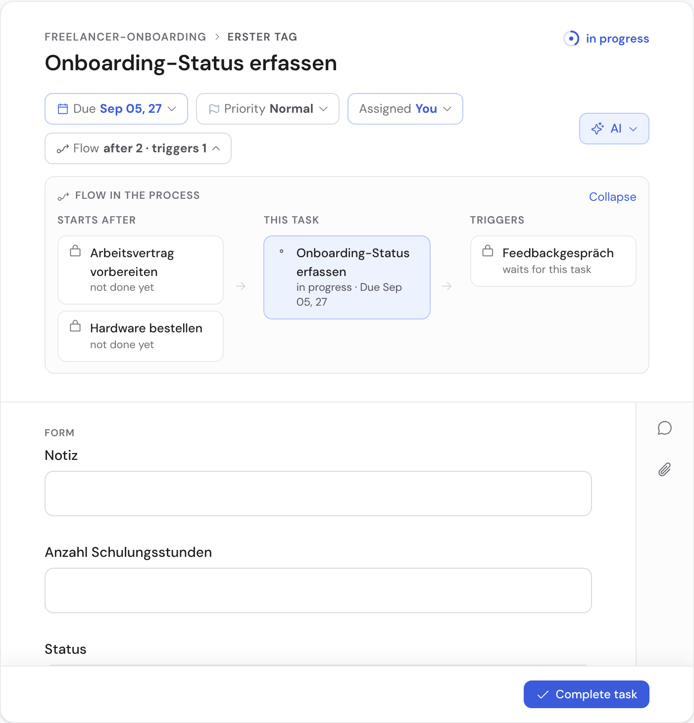
- Various field types — text, choice, date, number, file and more. Required fields must be filled in before you finish. Next to the “Result” heading a small hint shows how many required fields are still open (“N required fields left”) or that all of them are filled.
- Via “AI prefill” (in the task row’s ⋮ menu) the AI suggests values straight from the case — derived from data already captured in other tasks (automatically when you open it). You can additionally paste a source text or file (e.g. email, PDF) from which the AI reads matching field values. You review and confirm each value before it is applied — and can undo the whole apply right afterwards via the undo message.
- Comments on the task keep questions and notes in one place.
The task sheet
The sheet is ONE step, not a sequence of screens: the form is open, you fill it in, and the foot carries the status on the left (“2 required fields left” or “All required fields filled”) and the single action on the right. There is no intermediate page that shows your answers again for reading — you can see them in the form, and there you can change them too.
That is why validation happens in the form itself: if a required field is missing when you complete, nothing is completed — Bricksta marks the open fields with a red bar, jumps to the first one and puts the cursor in it. The status in the foot is clickable and takes you there as well. So you learn what is missing beforehand, instead of reading an error afterwards.
You finish with “Complete & next”. The button does both: it completes the task and opens the next one from your work queue straight away, so you can work through a series of tasks without returning to the list in between. Once nothing is left, you land on a completion screen instead of an empty table. If the task requires an approval, the button reads “Submit” — it is then handed over, but not yet done. A click can be taken back right afterwards via the undo message: Bricksta waits out that short window before it really writes the completion.
To the left of the sheet sits the work queue — the same queue the list shows, only narrow: grouped into Overdue, Due today, Later, “From the group pool” and “With others”, plus the tasks you completed today. Every group carries its count, at the top you search, filter and sort just like in the list, and clicking an entry switches the sheet. If you need the full width, you collapse the rail; that setting is remembered too.
Setting ownership
In My Work the way there is the row's three-dot menu: it carries “Assign …” and opens the assignee picker. Pick the person who should be responsible — the task immediately appears in their My Work list. In the case view and on the task sheet a click on the avatar still opens it; there the assignee differs from row to row and is therefore shown.
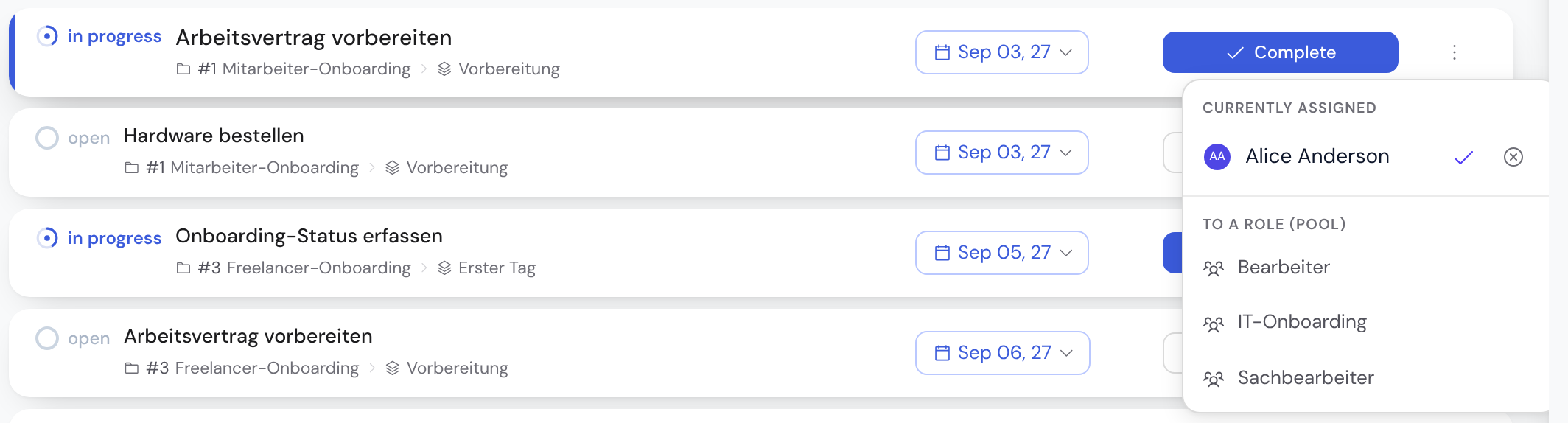
Instead of a single person you can also assign a task to a role. Then the whole team is responsible, and whoever takes it on makes it their own — handy for inbound queues where it is not yet clear who will handle it. In My Work such tasks sit in the “From the group pool — nobody responsible yet” section and carry a “Take on” button. Once you take it on, the task leaves the pool and moves into its due-date section; the role hint goes away with it, and it disappears from everyone else's pool. If someone else got there first, Bricksta says so on the click and refreshes the row instead of silently moving the task — nobody loses work they have already started. If it should change hands anyway, that is a reassignment via the assignee picker. The role stays visible on the assignee chip as its origin (“assigned to you · role …”) — it is the reason you were allowed to take the task.
The picker only lists people and roles that are actually allowed to work the task — that is, who hold the right to complete it. This keeps you from assigning someone who could not then act on it. If an already-assigned person or role later loses that right (for example because a permission was revoked), Bricksta flags the task with a “No execution right” notice — in the case view, in My work and on the open task sheet alike. The notice is about the assignment, not about you: if you personally hold the right (as an owner or admin, say), you can still take the task on — the warning then tells you the assigned pool could not complete it. The case list surfaces these cases in one place: an amber “N without permission” hint on the case plus an “Assignment drift” filter show every affected case at a glance, without opening each one.
Because starting and finishing belong together, even starting a task requires the right to complete it. If you lack it, the button stays visible but is disabled and states the reason — rather than letting you walk into a task you then cannot get rid of. This works the same everywhere: in the case view, in the My work list and on the open task sheet, and equally for “Complete” on a task that is already running. If your permission cannot be checked right now, the button says exactly that — not that you lack it. A task still sitting in a role pool carries the same button in both views: “Take on”. Only once it is yours does it read “Start”.
Setting priority and due date
You edit priority and due date as chips right in the row. One click opens the selection in place — no save dialog, no intermediate page. On the due-date chip the calendar is open right away: quick options “Today”, “Tomorrow” and “In 1 week” on top, the month sheet below, plus an optional time. The time field opens a list in quarter-hour steps; any other time you simply type into the field (“930” becomes 09:30). For dates further out, clicking the month in the header opens the month and year picker.
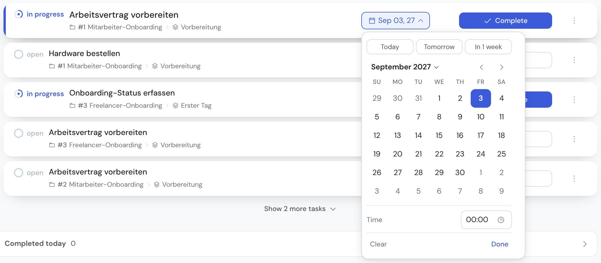
Normal is deliberately not shown as a chip, so only real escalations (high, urgent) stand out. Overdue and soon-due dates take on color so the order becomes visible.
Starting, completing and further actions
The action button on the right walks you through the task's lifecycle: for an open task you click “Start” (it moves to “in progress”), for a running one “Complete”. Completing releases the following tasks automatically, and the case's progress updates on its own.
If the task has output fields, Bricksta checks them on completion — without sending you to a second screen: if required fields are missing, “Complete task” does not complete anything but marks the gaps in the form with a red bar and jumps to the first one. Once everything is filled in, the same button completes the task. You then have five seconds to take it back via “Undo” before it is written. This works the same way in the case view and in the task sheet.
If a task's form cannot be loaded right now, Bricksta does not complete it: the task sheet tells you so with a notice and offers “Try again”, and the completion button stays disabled until it is there. The reasoning is the same as for missing required fields — completing cannot be undone, and without a loaded form there is no way to know what is still to be filled in. For the same reason the completion button stays disabled when Bricksta cannot determine whether the task has any fields at all — with a visible reason, rather than completing unchecked.
If the server does not answer at all while the completion is being written, the page stays usable regardless: after a short wait Bricksta tells you the outcome is unclear and reloads your tasks — the list then shows the state from the server. That is deliberately neither “completed” nor “failed”, because the completion may well have gone through. So check the reloaded list rather than pressing the button a second time.
If a query does not answer while you complete a task, the completion still goes out — but Bricksta tells you that something was disrupted: a red notice stays put on the case and names both the disruption and what is left open (“a query didn't answer — whether approval is needed couldn't be determined”). It does not disappear on its own; it goes away when you press “Try again”. Bricksta claims neither “done” nor “failed”: the server decided, and what came of it shows up in your list.
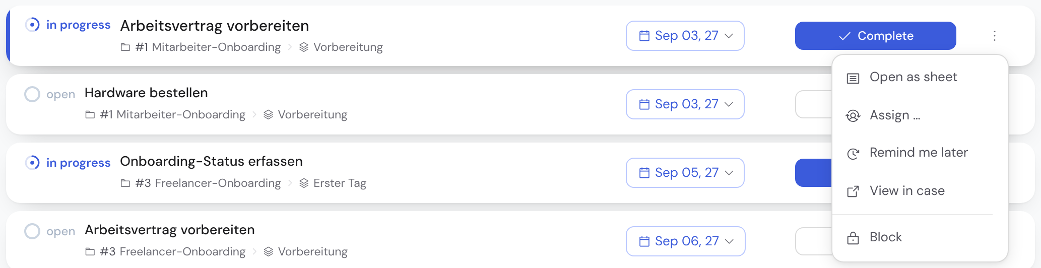
The secondary actions live in the menu at the right end of the row (⋮), in a fixed order: “Open as sheet” · “AI prefill” (only if the task has fields that can be prefilled — the AI suggests matching values) · “Snooze” · “View in case” and, set apart, “Block” if something must be clarified first. A blocked task stays visibly paused until the block is lifted — so no open point gets lost. Skipping a task is done in the case view.
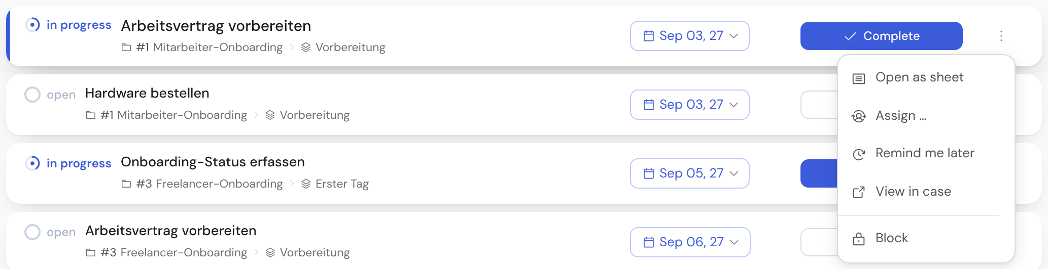
Starting happens immediately. After completing or skipping, a short notice with Undo appears — or press Ctrl/⌘ + Z.
Status is the truth: there is no second, manually maintained progress next to the actual state of the tasks. What is done is done.