On this page
Two views
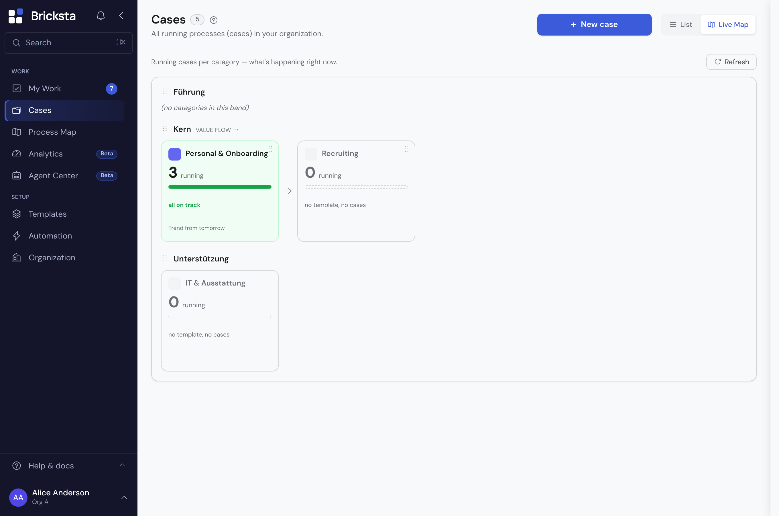
- Live Map
- Shows what is actually running right now: the active cases per category, with utilization, overdue and blocked counts. As a toggle at the top of Cases — or on the Process Map page.
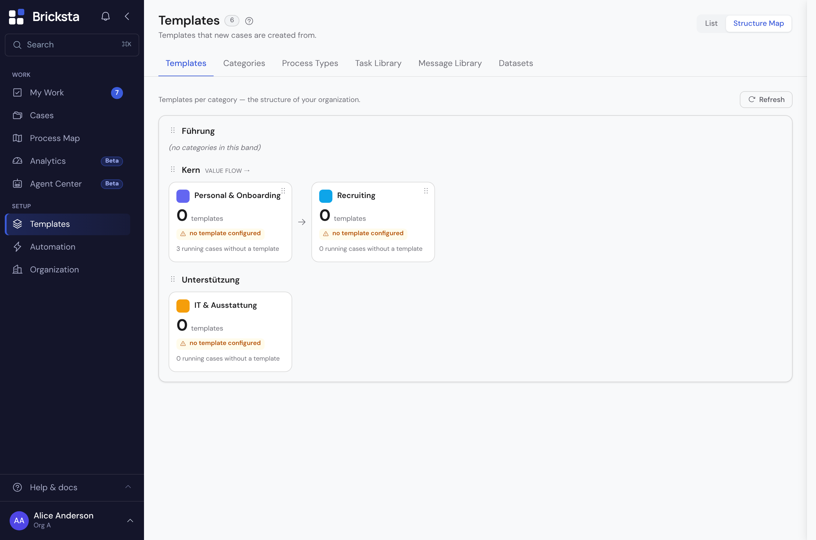
- Structure Map
- Shows how the flows are built: the categories and the templates assigned to them, independent of individual runs. As a toggle at the top of Templates — or on the Process Map page.
How the map is structured
The map is organized into bands — the process types (classically Leadership, Core and Support). Each band holds the categories that your templates and cases are assigned to. A band with value flow shows arrows and arranges its categories from left to right in value-creation order.
- As an admin you create the bands under Process Types and assign categories to them under Categories — order by dragging.
- Deleting a process type keeps its categories — they only lose their assignment to that band and then sit in the map without one. The confirmation dialog states how many categories are affected beforehand; you can assign them to another band afterwards.
- With “Create classic map” you generate Leadership / Core / Support in one click.
- A click on a category opens the filtered list of its cases (live) or templates (structure).
- Every category has a color and an icon — so the map stays readable at a glance.
- If a second language is configured for the organization, the Translate button (top right on the Process Types, Categories and Task Library tabs) reveals a secondary-language field below each name — empty = base language. The map and case lists then show the name in the active language.

What the Live Map shows
Per category you see the operational situation at a glance: how many cases are running, plus a state bar that splits them into five states — left to right on track, “due soon”, “cycle time ↑” (over target), blocked and overdue. Every case counts towards exactly one of them, and the segments always add up to the number of running cases.
- Overdue: the deadline has passed.
- Blocked: at least one task in the case is stuck. Blocked takes precedence over overdue — a case is never counted twice.
- Due soon: the deadline falls within the next five working days.
- Over target: the case is running longer than its template usually takes, even though its deadline has not passed. The reference is the median run time of the last 20 completed cases of that template; templates with fewer than five completions stay unrated.
- On track: everything else.
If a category has a process owner set (under Categories, optional), they appear as an initials badge in the top right of the card and as the panel header — the answer to “who do I ask about this?”, without opening a case first. Without an entry the space stays empty rather than showing a placeholder.
The card border is colored by the share of overdue and blocked cases — so a category where everything is stuck stands out even when not a single deadline has passed yet. Categories without running cases stay visible, just muted: the map shows your organization, not merely its workload.
On the standalone Process Map page (Work › Process Map) a status band sits above it with the org-wide picture: a traffic-light ring with the share of on-track cases, the total number of running cases, the comparison with yesterday, and tiles for this week's deadlines, open escalations and average cycle time versus target. Clicking a segment of the band filters the map down to the categories where that state occurs.
The numbers are entry points: click the running, overdue or blocked count to jump straight to the affected cases.
Cases that are not assigned to any category appear in their own “Without category” area at the end of the map — that way the sum of the cards always matches the total in the status band.
Filtering and sharing
Above the map there are three views: “All”, “Problems only” (categories with overdue or blocked cases) and “My areas” (categories where you are responsible for running cases yourself). Next to them sits the Live ↔ Structure switch, then a search field for category names — the “/” key jumps into it. On the right you see how many categories the current selection leaves. In the structure view the three views drop away: they count running cases, which do not exist there.
View, search, state, point in time and the opened category live in the address bar. So a link to “Sales, overdue only” can be passed on, and the back button returns to the previous view instead of leaving the page.
Looking back
The page header holds a slider that takes you back in time: the last 30 days day by day, before that in weekly steps, and from half a year back in monthly steps. Its left-hand label says how far the record reaches, the right-hand one names the selected day. The status band and the cards then show that day; the pill next to the title switches from “live” to “looking back”. The slider ends at the oldest daily record available — a young organization does not have it yet. If the history cannot be reloaded on refresh, the previously loaded one stays and the page says so below the header — rather than silently falling back to today's numbers.
For days before the map was rebuilt, only running and overdue cases were recorded. The bar has two parts there instead of five — the other states were simply not collected for those days, and they are not invented after the fact.
While looking back, everything that only holds for the present steps aside: this week's deadlines, open escalations, cycle time and the hotspots. They describe what to do now — read next to a past number they would imply a connection that does not exist.
Hotspots and the category panel
To the right of the map sit the hotspots: the categories where most is currently stuck, ranked automatically. The ranking is proportional — a small category with half of it hanging comes before a large one where a fraction is overdue. Every row names the reason (“4 overdue · 1 blocked”) so the placement stays traceable. When everything runs smoothly the list stays empty instead of padding itself with unremarkable categories.
Clicking a category — on the card, on a bar segment, or in the radar — opens the panel: four key figures (running, critical, avg. run time, open tasks) and the case list below. “Critical” combines overdue and blocked cases — those where the promise is already broken; cases merely due soon are not counted. Clicking the tile lists exactly those cases. The line below counts everything “needing attention” more broadly (adding due soon and “cycle time ↑”); the “?” in both places spells out what goes into the number. “Avg. run time” is the one tile whose value and click differ: it shows the average age of all running cases, while clicking lists those over target — the “?” says so. Each row shows state, owner, age and deadline; expanded, it adds the phases of the running workflow, a reason (for blocked cases the waiting task and since when) and the jump into the case.
The list can be shorter than the number on the card: the count covers the whole organization, the list only shows what is visible to you. Where there is a difference, the panel says so explicitly.
Presenting
“Presentation” hides the app surroundings and shows only the map — for the wall in the meeting room. Inside it you can switch on the tour: it walks through the hotspots one by one, moving on every five seconds. The map steps back while it runs, except for the category currently being discussed. Leaving the presentation ends the tour by itself.
If your system requests reduced motion, the tour does not advance automatically — buttons for previous and next appear instead.
The Structure Map
The same map exists as a structural view of templates: via the “Structure Map” toggle — on the templates page or on the standalone Process Map page (Work › Process Map, with the same Structure ↔ Live toggle) — you see which templates belong to which category and band, regardless of whether a case is currently running.
Automatic and up to date
The map is derived from your existing templates and cases. There is no extra model to maintain and no manual refresh step for the underlying structure.
Because the map emerges from your real data, it always reflects the actual state — not a diverging diagram that someone would have to keep up to date by hand.