On this page
The cases list
Under Cases you see all the cases of your organization — as a list grouped by where action is needed, or as a Live Map. The view tabs at the top switch between “All open”, “My cases”, “Overdue”, “Unassigned” and “Completed”; each tab shows its count. You can keep a filter combination as a named view via “Save view” — it is visible only to you. A filtered view can also be shared as a link via the address bar — including the term from the search box: it appears as q in the address, and whoever opens the link sees the same filtered list.
The list only ever shows the active organization. If a link — for example from a notification email — leads to a case in another of your organizations, Bricksta first shows a notice naming both and only switches when you click; see Settings and account, section Active organization.
The metrics row above sums up the four most important signals: overdue, permission gap, no movement for over three days, and completed this week. Clicking a card filters the list down to exactly those cases. Below, cases are split into two groups — “Needs attention” (overdue, blocked, assignment unclear, stalled, or an open incident) and “Running”. In the attention group each row states the reason in a signal color and the next open task, so it is immediately clear what to do. When the flow has stopped because of an incident — for instance because a review loop reached its round limit — the reason reads “flow stopped — open incident”, and it takes precedence over all others: “overdue” says something is late, an open incident says why nothing is moving any more. Only incidents that actually halt the flow count here — a mere warning, such as a failed entry in an external system, leaves the case running and does not color the row.
If one of the supporting figures cannot be loaded — progress, blocked state, permission gaps — a notice appears above the list and everything derived from it disappears: the affected metric, the next step, the step position, the blocked marker. An active filter on it is lifted so the list doesn't silently run empty. That is deliberate — without the data any statement about it would be a guess, and a guessed number looks exactly like a finding. Hovering the notice tells you which figures are missing; the cases themselves are complete and fully usable.
If the case list itself fails, however, the area below stays empty — you will see neither “No cases yet” nor “No matches” there. That is deliberate too: how many cases exist is simply unknown at that moment, and either sentence would be a claim about it. The notice above the list carries the case on its own, with a “Try again” button. If cases had already loaded and only a follow-up page failed, they stay on screen — they have been read.
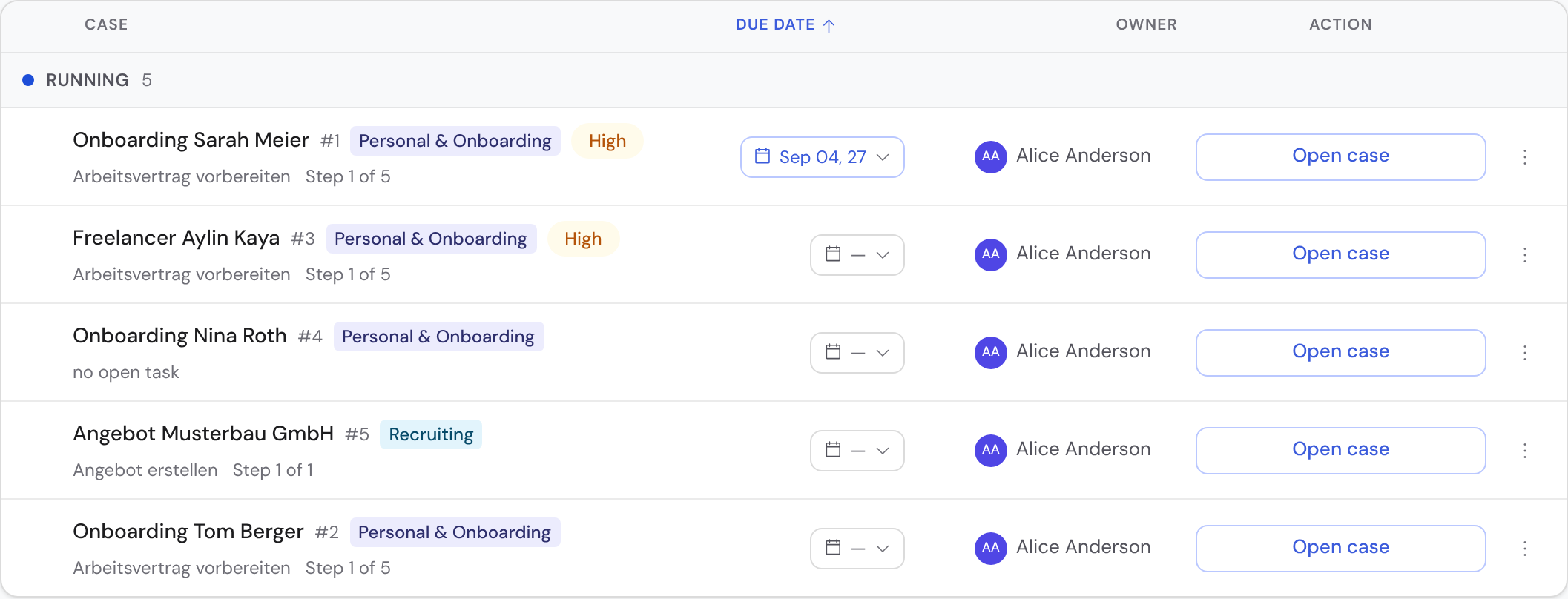
Above the list sits a header row with the columns “Case”, “Due date”, “Owner” and “Action”. Clicking any of these four column headers sorts by it; clicking again reverses the direction. “Owner” sorts by the displayed name; cases without an owner come last in both directions. To sort by “Created” or “Priority”, use the sort control in the top right of the page header; the arrow on its left reverses the direction. The same row holds “New case” to its left, the “Filter” button to its right and, at the far right, the List/Live Map switch — it stays in place when you change the view. “New case” expands the template picker right below the header — with search, “Recently used” and groups by category — and, once you pick one, the start form, just like under “My Work”. Under “My Work” you sort in the same place, but over different fields — “Created” is not among them. While you scroll, the header row and the current group heading stay pinned at the top. Long lists load in portions: Bricksta starts with the first rows and appends the next ones automatically as you scroll; at the end of the list there is also a “Load … more” button. The number on the group heading always names the full count regardless. On narrow screens each row becomes a card and sorting moves into the “Filter” area.
Each row shows title and number, category and priority, the favorite star and, on the right, the due date and ownership plus a primary action. You edit the due date and the owner right in the row: both are chips, and a click opens the picker — the same chips you know from “My Work”. The due date reads as day and month and turns red once it is overdue — what counts is the calendar day in Berlin, whatever time zone your computer runs in —, amber when it falls due within the next two days; if it lies in another year, the year is shown as well. The ⋯ menu sets the favorite or copies the link; as an org admin you also delete the case there. Select several rows with the checkbox (hold Shift for a range) and act on them together via the action bar — every bulk action can be undone. When several people work at once, Bricksta collects other people’s changes into a pill “Updates available · Reload” instead of re-sorting the list under your cursor.

Starting a case
Pick a template and start a case via “Create case”. Bricksta creates the tasks according to the blueprint. From that moment the case is independent — later changes to the template do not alter it retroactively; it runs with the version it was started on.
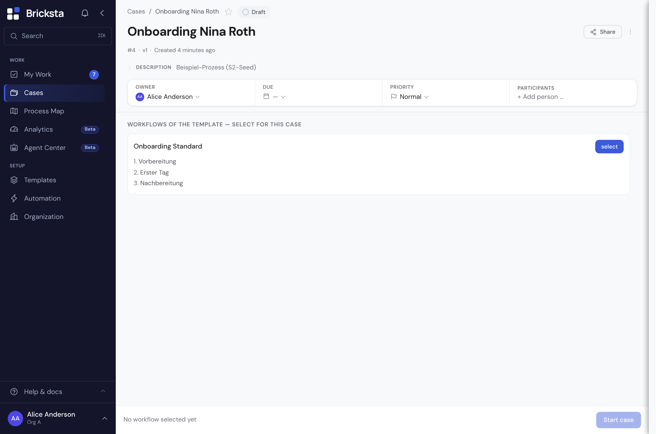
If the template comes with several workflows, you first decide in the draft which of them this case should run — each one via “select” or all at once via “Select all” at the top right of the section. Then you start the case via “Start case”.
Working through the tasks
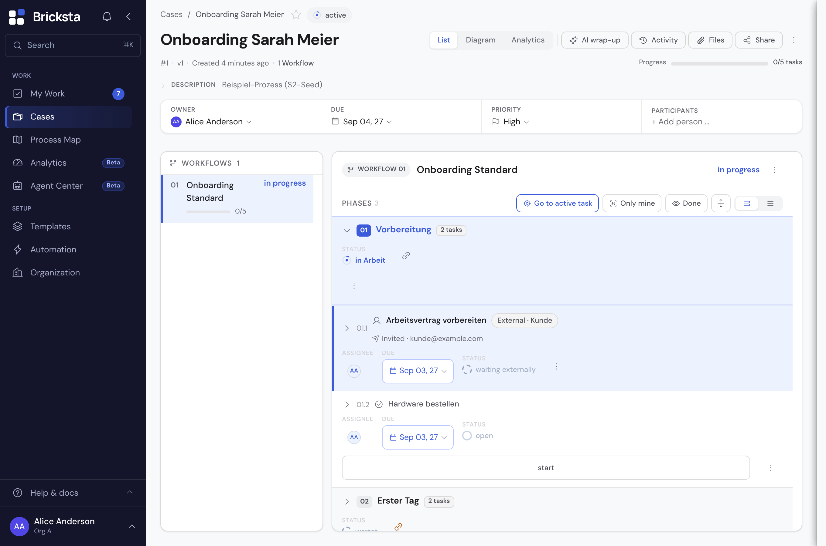
Clicking a case row opens the detail page. At the top sit status, ownership, due date, priority and progress; below them the workflow instances — clicking a phase expands it. What a click on a TASK does depends on the window width: on a wide screen it opens as a sheet to the right of the list, which narrows and stays put as your overview — the “×” in the sheet gives the list its full width back. On narrow screens the task expands inside its row as before. Next to an open sheet the header fields (owner, due date, priority, participants, progress) step aside; the space belongs to the work on the task. Runs of already-completed phases collapse into a single summary row so your eye lands on the active phase — click it to show them individually again, or use “Expand/collapse all” in the toolbar to open or close them all at once. Files open via the “Files” button in the top right — it shows the count and lists every file of the case grouped by origin: those of the case itself and those of individual tasks, each with a jump to the task. Renaming, replacing and deleting live in the row’s ⋮ menu; both irreversible actions ask first, and after a deletion you have a few seconds to undo it before the file really goes. Comments and the history open next to it via the “Activity” button — it shows the comment count and opens a panel you can reach from both the list and the diagram view.
The active task is highlighted with a blue edge so you can spot it at a glance in long cases; its phase is tinted blue as well. The “Go to active task” button in the top right jumps straight to it — the relevant workflow and phase expand automatically. If several tasks are ready to work on, each further click jumps to the next one.
- 1Expand a workflow instance and see the tasks in their order.
- 2Work on an open task: the first saved entry in any field automatically moves it to “In progress” — you don't have to start it separately. Fill in its fields and complete it, or skip it if it does not apply in this case.
- 3Following tasks are released automatically as soon as their predecessors are done.
- 4The case's progress updates on its own — you do not maintain a second status alongside it.
The expanded task is split in two: on the left the form with its output fields, on the right a collapsible column with two tabs — “Comments” and “Files”. The “Comments” tab holds the comments on this task — type “@” there to mention colleagues, who then receive a notification. The “Files” tab holds the files of this task. Given enough room the column starts out open on the comments; collapsed it leaves a narrow strip with two icons whose counters show whether there are comments or files. If the window is too narrow, the column moves below the form, both its tabs with it. Not to be confused with the “Activity” panel in the top right: that holds the comments on the whole case, this one those on exactly this task.
Cases and My Work update in real time: if someone else works on the same case, you see the change without reloading the page.
The states of a task
Every task has exactly one status. The progress of the case follows from the states of all its tasks. The small status explanation in the case sums up the current states.
- Open
- Released and ready to be worked on.
- In progress
- Currently being worked on — the first saved entry moves an open task here automatically (or use “Start”).
- Waiting
- Still waiting for a preceding step and therefore not released — what it is waiting for is shown right on the waiting item (in both list and diagram).
- Blocked
- Deliberately paused — something needs to be clarified before it continues.
- Done
- Completed; counts towards the progress.
- Skipped
- Not applicable in this case and therefore left out. For a skipped phase the reason is shown right on the row — for example “condition not met” or “skipped manually”; hover it to see the full sentence including the reason someone typed.
Priority and due date
Case and tasks optionally carry a priority and a due date. Both appear as a chip in the case header and can be changed right there. Overdue and soon-due dates are highlighted in color so you can see what comes first.
The flow inside the case
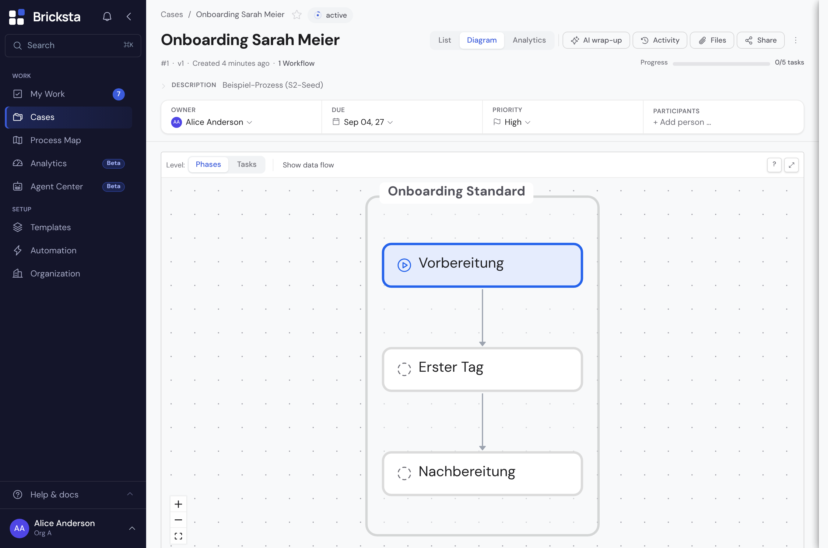
Via the “List / Diagram” toggle in the top right you view the same flow from two angles — each with the live state: you see at a glance what is done, what is in progress and what is still waiting. The list view is the working view (this is where you work on tasks); the diagram view focuses entirely on the flow. Files, comments and history are always reachable via the “Files” and “Activity” buttons — in all views.
The “AI wrap-up” button in the top right reveals the “Case status” card — a short AI summary of the current state (progress, workload). It is deliberately hidden until you ask for it, so the top of the case stays free for the actual work. It is only created on an explicit click on “Generate summary” — only then are there any costs, nothing happens automatically. The card remembers the summary together with a timestamp and quietly flags when something has changed since and it may be outdated; “Regenerate” refreshes it. “×” or another click on “AI wrap-up” only collapses the card — the summary stays saved and is back the next time you open it, and a small dot on the button tells you a saved summary is waiting. The “AI” entry in the “⋮” menu additionally opens the case insights, which explain deterministically why the case is currently waiting or blocked.
Participants, auditability and guest link
Besides the responsible person you can add further editors and watchers to the case. Shown openly are the roles this template actually uses plus every role already filled in this case; all other roles of your organization sit below them behind “Other roles” with their count — one click expands them, and you can still fill them. Every important step is recorded in the history — when a task was completed, assigned or blocked. Via an external guest link a single task can be filled in from outside without a login.
Keeping important cases in view
Mark a case with the star as a personal favorite. You can reach your favorites any time via the ⭐ filter under Cases and as a quick-access bar at the top of My Work (on narrow phone screens that space is reserved for the task list — use the filter there instead). When a case is completed, it is removed from the favorites automatically.
Status is the truth
The progress of a case is not a manually set percentage but the result of the tasks actually completed. That makes every case traceable and comparable.